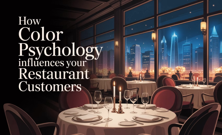
Choosing the right restaurant colors can make or break your customers’ dining experience. Color psychology plays a huge role in appetite stimulation, emotional connection, and overall brand identity. In this post, we’ll explore the best restaurant color strategies to drive more sales and enhance your food business. Choosing the right colors can enhance customer satisfaction. It can make a space feel inviting and memorable. Warm colors like red and orange stimulate appetite. They encourage diners to eat more and stay longer. Cool colors like blue and green create a calming atmosphere. However, they might suppress appetite if used excessively.
Neutral tones offer sophistication and elegance. They are perfect for upscale dining environments. Understanding color psychology is essential for restaurant branding. It helps align the dining room colors with the restaurant’s identity.
In this article, we explore the best colors for food businesses. Discover how to use them to create a successful dining experience.
The Power of Color Psychology in Restaurants
Color psychology is a fascinating aspect of restaurant design. It’s about understanding how colors affect human emotions and actions.
In restaurants, colors can sway decisions. They can enhance appetite, alter perceptions of taste, and even affect how long customers linger.
Key Effects of Colors in Restaurants:
- Warm colors: Boost energy and appetite.
- Cool colors: Offer calm and relaxation.
- Neutrals: Provide elegance and sophistication.
Restaurant owners can leverage these insights strategically. Using the right colors can create an environment that encourages spending and improves customer satisfaction.
For instance, a cozy warm palette might prompt diners to order dessert. Meanwhile, a chic, minimalist design could attract a trendy, upscale crowd.
Color psychology goes beyond aesthetics. It’s about crafting an experience that aligns with your business goals. Understanding these dynamics can set your restaurant apart. It offers a competitive advantage in a crowded market.
How Colors Influence Dining Mood and Customer Behavior
Colors have a profound impact on dining moods. They can stimulate specific emotional responses. This makes them powerful tools for influencing customer behavior.
Certain hues are associated with different feelings. These associations can vary based on cultural contexts. However, some general trends hold true across many cultures.
Key Colors and Their Effects:
- Red: Invokes urgency and appetite.
- Blue: Provides calm, may reduce appetite.
- Green: Suggests freshness and health.
- Yellow: Creates warmth and happiness.
In a restaurant setting, understanding these effects is crucial. It helps design spaces where customers feel comfortable and happy. For example, fast-food chains often use bold colors to encourage quick dining and turnover.
Conversely, fine dining establishments might opt for cooler tones. These create a relaxed atmosphere where patrons linger, enhancing the dining experience.
The choice of colors should also reflect the restaurant’s brand identity. A well-curated palette can leave a lasting impression.
Warm Colors: Stimulating Appetite and Energy
Warm colors have a special place in the food industry. They have the power to stimulate appetite and boost energy. This makes them popular choices for restaurant interiors.
The Impact of Warm Colors:
- Red: Known to increase heart rate and stimulate hunger.
- Orange: Encourages socialization and warmth.
- Yellow: Evokes happiness and optimism.
Red, orange, and yellow are vibrant and inviting. They create an energetic atmosphere that can enhance dining experiences. Customers tend to feel more enthusiastic and upbeat in these environments.
These colors are particularly effective in fast-casual dining spaces. Here, the goal is to promote quick decisions and increase turnover. The vibrant tones prompt diners to eat swiftly, making room for the next guests.
In more leisurely settings, warm colors can be balanced with neutrals. This combination maintains energy while promoting a relaxed vibe. The right blend can encourage guests to stay longer, boosting sales and satisfaction.

Red in Food Branding and Restaurant Design
Red is synonymous with food branding. Its use is prevalent in restaurant logos and menus. This vibrant hue is strongly linked to appetite.
Reasons to Choose Red:
- Stimulates hunger: Often associated with urgency.
- Enhances visibility: Eye-catching and engaging.
- Conveys excitement: Creates a lively dining atmosphere.
Fast-food chains heavily rely on red’s ability to create excitement. This is why it’s a dominant color in their branding. Red draws attention and makes establishments memorable.
Additionally, red can be strategically placed in interior design. Accent walls or table settings can incorporate this lively shade. However, overuse can overwhelm; hence, balance is crucial.

Orange and Yellow: Creating a Welcoming Atmosphere
Orange and yellow offer a sense of warmth. These colors are excellent for creating a welcoming environment. Their cheerful nature encourages social interaction.
Benefits of Orange and Yellow:
- Evokes happiness: Positive and uplifting.
- Boosts energy: Promotes lively conversations.
- Encourages interaction: Makes spaces feel inviting.
These colors are ideal for casual dining settings. An orange accent wall or yellow tableware can transform the dining space. The cheerful tones foster a friendly and informal environment.
Restaurants can use these colors to highlight specific areas. For instance, an orange-toned bar space can seem more approachable. The goal is to make patrons feel comfortable enough to extend their visit.
As with red, it’s essential to apply orange and yellow judiciously. Proper lighting can further enhance their impact, ensuring a balanced and harmonious design.

Cool and Neutral Colors: Calming, Sophisticated, and Modern
Cool and neutral colors bring a different vibe to dining spaces. They are known for their calming and sophisticated qualities. These hues can create a modern and elegant ambiance.
Advantages of Cool and Neutral Colors:
- Calming effect: Blue and green offer tranquility.
- Sophisticated appeal: Neutrals provide a classy touch.
- Modern style: Adds a contemporary edge to design.
In fine dining restaurants, cool colors lend a serene atmosphere. They can promote relaxation, which can enhance the dining experience. This is ideal for patrons looking to enjoy a leisurely meal.
Neutral tones like beige and gray are versatile. They blend easily with any design theme. Their understated elegance can elevate the overall aesthetic.
Using these shades can also help highlight food presentation. With a simple backdrop, the colors of dishes stand out more. Cool and neutral colors can thus complement gourmet experiences.

Blue and Green: When to Use and When to Avoid
Blue and green are cool colors with distinct characteristics. They offer a sense of peace and can be soothing. However, these shades must be used with care.
Situations for Blue and Green:
- Use for tranquility: Ideal for quiet, calm environments.
- Avoid in fast-food: May suppress appetite.
- Great for eco-friendly themes: Reflects nature and freshness.
Blue can work well in seafood restaurants. Its association with the sea resonates with the theme. However, in fast dining, it can deter appetite.
Green, meanwhile, is perfect for health-focused eateries. Its natural appeal promotes freshness and nutrition. Yet, using too much can overpower the other decor elements.
Both colors can be excellent accent choices. Incorporate them in smaller details or decorative pieces. This way, they enrich the ambiance without dominating the visual space.

Neutrals and Earthy Tones: Elegance and Comfort
Neutrals and earthy tones exude elegance. These colors ground a space and offer a warm welcome. They suit diverse dining settings.
Benefits of Neutrals and Earthy Tones:
- Timeless appeal: Classic and adaptable.
- Creates warmth: Makes guests feel at home.
- Blends well: Complements various themes effortlessly.
Beige, taupe, and brown bring comfort to a room. Earthy tones can give diners a sense of peace and stability. This is ideal for rustic or farm-to-table establishments.
These colors support layered interiors. Paired with rich textures and materials, they enhance depth. The combination cultivates a space that’s both luxurious and inviting.
Using these tones can also reflect cultural themes. They often evoke a connection to heritage and tradition. This makes them a popular choice for thematic and family-oriented spaces.

Restaurant Branding Colors: Aligning Palette with Identity
In the competitive food industry, colors play a crucial role in branding. The right restaurant branding colors can reinforce a brand’s identity. A cohesive color scheme enhances recognition and loyalty.
Consider how each hue conveys different messages. Colors should align with the restaurant’s concept and values. This helps create a strong brand image and resonates with customers.
Key Points for Choosing Branding Colors:
- Consistency: Align colors with logos and marketing materials.
- Emotion: Choose hues that evoke the right feelings.
- Differentiation: Stand out from competitors using unique palettes.
For example, a restaurant focusing on organic produce might use earthy greens. This complements their eco-friendly message. In contrast, a modern café might employ sleek, neutral tones for a contemporary feel.
Maintaining consistency in color choices across all platforms is vital. From menus to signage, the palette should be recognizable. This consistency builds trust and familiarity with patrons.

Dining Room Colors for Different Restaurant Types
Choosing the right dining room colors can transform the dining experience. Different eateries often require distinct palettes. These colors should reflect the restaurant’s theme and concept.
Casual dining spots might favor vibrant and lively hues. This creates a relaxed atmosphere that encourages social interactions. On the other hand, fine dining establishments often use darker tones. Deep hues like burgundy and charcoal exude elegance and sophistication.
Color Suggestions for Various Restaurant Types:
- Family-Style: Bright, cheerful colors create warmth.
- Fast Food: Bold, attention-grabbing colors like red and yellow.
- Cafés: Soft, relaxing shades such as pastels and muted earth tones.
Ethnic restaurants might use colors that represent cultural heritage. For example, a Mexican restaurant may incorporate rich reds and oranges. Colors that conjure images of the cuisine can enhance authenticity.
Lighting is also key. It should complement the chosen palette. Proper illumination accentuates colors, enhancing diners’ experience.

Italian Colors in Restaurant Menus and Decor
Italian restaurants often embrace the hues of the Italian flag. Red, white, and green not only reflect national pride but also evoke authenticity. These colors are central to Italian branding.
Using red can enhance the appeal of rich tomato dishes. Green complements fresh ingredients like basil. White provides balance and elegance in menus and decor.
Key Elements of Italian Restaurant Colors:
- Red: Passion and appetite stimulation.
- Green: Freshness and health.
- White: Simplicity and purity.
Incorporating these colors strategically can evoke a genuine Italian feel. Menu designs might feature these hues to draw attention to signature dishes. Decor elements like tablecloths or wall art can also use this palette effectively.

Restaurant Color Trends and Tips for Restaurant Interior Design
Color trends in restaurant interior design can shift frequently. Staying updated helps maintain a fresh and inviting ambiance. Current trends often embrace sustainability and natural elements.
Subtle, earthy tones are gaining popularity for their versatility and calming effect. They offer a neutral canvas, allowing other design elements to stand out. Additionally, biophilic design, which incorporates natural elements, is trending.
Current Color Trends in Restaurant Colors in Interior Design:
- Biophilic Elements: Use greens and browns to connect with nature.
- Sustainability: Earthy tones promote an organic feel.
- Minimalism: Monochrome palettes for clean, uncluttered spaces.
Designers should also consider the psychological impact of colors. Selecting hues that align with a restaurant’s theme ensures consistency and coherence. Additionally, emphasizing functionality and aesthetic balance is crucial.

Pro tip: balance trendy colors with timeless features. This ensures spaces remain appealing as trends evolve. Remember, thoughtful color selection can enhance your brand’s identity and customer experience.
Practical Steps to Choose the Best Colors for Your Food Business
Choosing the right colors for your food business is essential. A well-chosen palette can elevate your brand and customer experience. Here are some practical steps to guide you.
Start by identifying your brand’s core values and target market. Your color choices should resonate with your audience’s preferences. Consider how colors will influence their dining mood and behavior.
Next, explore different color palettes. Warm tones like red and orange encourage appetite. Cool colors like blue may calm diners. Neutral hues can create a sophisticated and elegant environment.
Steps to Follow:
- Define Brand Identity: Understand your vision and target market.
- Research Color Psychology: Know how colors influence behaviors.
- Test with Accents: Use small amounts first to gauge reaction.

Experiment with different combinations and lightings before finalizing. Consider conducting a small test with your chosen scheme to observe reactions. This ensures your colors enhance both your food business and your brand identity.
Conclusion: Creating a Memorable Dining Experience with Color
The right colors can transform your restaurant and enrich the diner’s experience. By thoughtfully selecting colors that align with your brand and target audience, you enhance appeal and potentially increase sales.
Remember, color is a powerful tool that can evoke emotions and influence behavior. So, whether you seek to create a cozy retreat or a bustling bistro, let color be your guide to crafting an unforgettable dining experience.
Feel free to visit our portfolio on Behance and Dribbble
Get expert touch in your restaurant branding
Contact Us Now

June 29, 2025
Social Media Graphics Trends: Tips and Best Practices

June 29, 2025


droversointeru August 31, 2025
I’ve been absent for a while, but now I remember why I used to love this website. Thank you, I?¦ll try and check back more often. How frequently you update your site?
Patti Pajtas September 22, 2025
Hello, i think that i noticed you visited my site thus i came to “go back the desire”.I’m trying to to find things to enhance my web site!I assume its adequate to use a few of your ideas!!
sprunki game September 27, 2025
Great article! It’s refreshing to see such deep strategic insight applied to Texas Hold’em. For those looking to mix things up creatively after a long session at the table, check out Sprunki Game-it’s a fun way to explore new rhythms and sounds.
vorbelutr ioperbir October 20, 2025
I like this post, enjoyed this one thankyou for putting up.
gadonthomobet November 13, 2025
Hmmm, what’s the scoop on gadonthomobet? Never heard of it before. Lots of games to play, I hope! I’m going to give it a try.. Play and explore here: gadonthomobet!
3reyescasino November 28, 2025
3reyescasino? Sounds like a party! I’m always ready for some action. Hope they’ve got my favorite table games and a decent bonus. Let’s see if 3reyescasino brings the heat!