When customers walk into a restaurant, they taste the food with their eyes first.
Before the menu is read, before the first bite is taken, color has already influenced their appetite, mood, and buying decision. They don’t just judge your interior decoration; they also judge your restaurant colors and branding.
From fast-food giants to fine-dining restaurants, successful food brands don’t choose colors randomly. They use color psychology as a strategic tool to trigger hunger, speed up decisions, and increase sales.
In this guide, we’ll break down the most effective restaurant colors, explain why they work, and show how smart color choices can directly impact your revenue.
Why Restaurant Colors Matter More Than You Think
Color affects the brain faster than text or images. Studies in consumer psychology show that:
- People form an opinion about a brand within seconds, largely based on color
- Certain colors stimulate hunger, while others suppress it
- Color influences how long customers stay, how much they order, and how often they return
In short:
👉 The right restaurant colors can boost appetite and sales
👉 The wrong colors can silently push customers away
Red: The Ultimate Appetite Trigger
Red is one of the most powerful food-related colors in the world.
Why Red Works in Restaurants
- Increases heart rate and excitement
- Stimulates hunger and urgency
- Encourages quick decisions
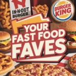
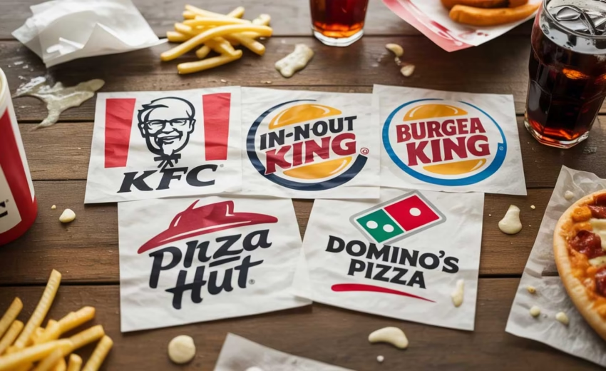
That’s why red is heavily used by fast-food and high-turnover restaurants.
Best Use Cases for Red
- Fast food restaurants
- Burger joints
- Fried chicken brands
- Snack-focused outlets
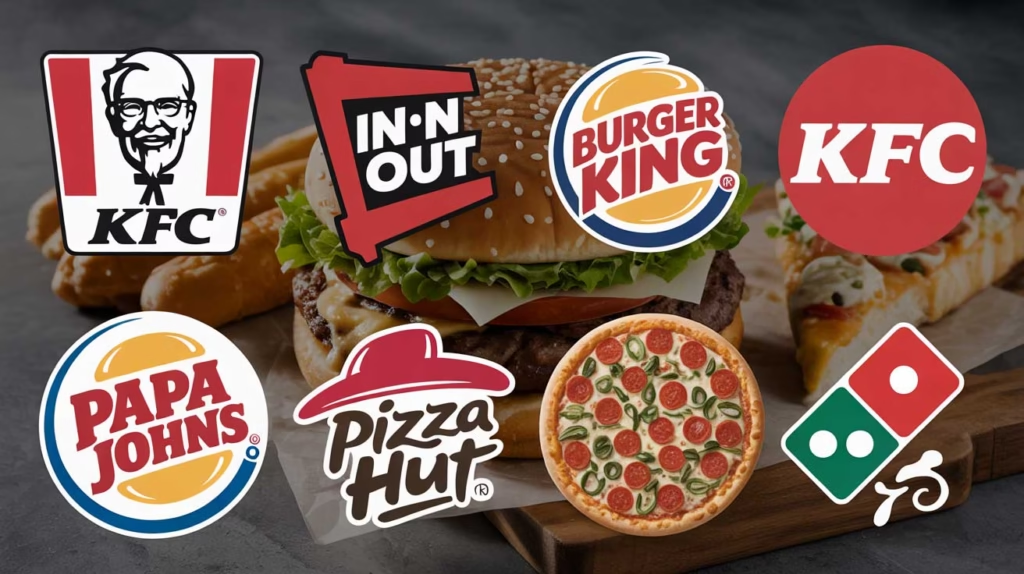
Famous Examples
- McDonald’s
- KFC
- Burger King
- Pizza Hut
🔴 Design Tip:
Avoid using red everywhere. Combine it with neutral tones or yellow to prevent visual fatigue.
Yellow: The Color of Happiness and Hunger
Yellow pairs perfectly with red — and there’s a reason this combo dominates fast food branding.
Why Yellow Works
- Creates feelings of happiness and warmth
- Grabs attention quickly
- Encourages impulse buying
Yellow also improves brand visibility, especially from a distance.
Best Use Cases
- Fast food restaurants
- Cafés
- Street food brands
- Takeaway shops
🟡 Design Tip:
Use yellow for highlights, signage, or call-to-action areas rather than full backgrounds.
The Red & Yellow Power Combo (Why McDonald’s Nailed It)
McDonald’s didn’t choose red and yellow by accident.
Together, they:
- Trigger hunger (red)
- Create happiness and energy (yellow)
- Encourage quick eating and faster table turnover
This combo is ideal for businesses that rely on high volume and fast service.
If you’re running:
- A fast-food brand
- A takeaway-focused restaurant
- A food truck
👉 Red + Yellow is still one of the strongest combinations available
Orange: Friendly, Fun, and Appetite-Boosting
Orange blends the energy of red with the happiness of yellow.
Why Orange Works
- Feels friendly and affordable
- Encourages social interaction
- Stimulates appetite without aggression
Best Use Cases
- Casual dining restaurants
- Cafés and bistros
- Family-friendly food brands
🟠 Design Tip:
Orange works great for logos, menus, and accent walls but can feel overwhelming if overused.
Green: Fresh, Healthy, and Trust-Building
Green is the go-to color for organic, healthy, and eco-conscious restaurants.
Why Green Works
- Represents freshness and natural ingredients
- Builds trust and calmness
- Reduces stress and makes people stay longer
Best Use Cases
- Organic restaurants
- Vegan and vegetarian brands
- Salad bars
- Health-focused cafés
🟢 Design Tip:
Pair green with white, beige, or wood textures to enhance the “clean food” look.
Brown: Comfort, Warmth, and Authenticity
Brown is deeply connected to natural materials and comfort food.
Why Brown Works
- Feels warm and grounded
- Suggests quality and tradition
- Works well with wood interiors
Best Use Cases
- Coffee shops
- Bakeries
- Barbecue restaurants
- Rustic or traditional dining spaces
🟤 Design Tip:
Combine brown with cream, gold, or dark green for a premium yet cozy atmosphere.
Black: Luxury, Drama, and Premium Appeal
Black isn’t an appetite color — but it elevates perceived value.
Why Black Works
- Signals sophistication and exclusivity
- Enhances contrast and presentation
- Makes food visuals pop
Best Use Cases
- Fine dining restaurants
- Premium bars
- High-end dessert brands
⚫ Design Tip:
Always balance black with warm lighting and accent colors to avoid a cold feel.
White: Clean, Minimal, and Modern
White gives space for food to shine.
Why White Works
- Creates a clean and hygienic impression
- Makes colors and dishes stand out
- Feels modern and minimal
Best Use Cases
- Modern restaurants
- Cafés
- Dessert shops
⚪ Design Tip:
White works best when paired with accent colors like green, gold, or soft gray.
Color Choices Based on Restaurant Type
| Restaurant Type | Best Colors |
|---|---|
| Fast Food | Red, Yellow, Orange |
| Casual Dining | Orange, Brown, Green |
| Organic / Healthy | Green, White, Earth tones |
| Café / Bakery | Brown, Beige, Soft Orange |
| Fine Dining | Black, Dark Blue, Gold |
How Color Affects Menu Design & Ordering
Color isn’t just for walls and logos — it directly affects menu performance.
Smart menu color strategies:
- Use red or orange for best-selling items
- Highlight combo meals with warm colors
- Use green icons for healthy options
- Avoid blue for food-heavy menus (it suppresses appetite)
Well-designed menus increase average order value without customers noticing.
Common Restaurant Color Mistakes to Avoid
🚫 Using too many bold colors
🚫 Ignoring brand positioning
🚫 Choosing trendy colors without strategy
🚫 Poor contrast affecting readability
🚫 Not aligning colors with food type
Color should support your brand story, not fight against it.
Final Thoughts: Color Is a Silent Salesperson
Great food brings customers in once.
Great branding — especially color — brings them back.
The most successful restaurants use color psychology to:
- Trigger appetite
- Influence emotions
- Improve brand recall
- Increase sales naturally
If you’re planning a new restaurant or rebranding an existing one, color strategy should never be an afterthought.
Want Expert Help With Restaurant Branding?
At DesignoFly, we design food brands that don’t just look good — they sell.
From restaurant branding to packaging and menu design, we combine psychology, creativity, and AI-powered design strategy to help food businesses stand out.
Need support with your restaurant Branding?
Contact us now
Feel free to visit our portfolio. Behance & Dribbble
We are accepting direct orders from Dribbble. Feel free to visit our services section on Dribbble or click the link below. Dribbble Services

December 30, 2025
Top Graphic Design Agency for Businesses in the...
December 30, 2025