When people think about what makes a restaurant successful, they usually mention food quality, pricing, location, or service. Very few immediately think about color—yet color is one of the most powerful silent sales tools in the restaurant industry. Long before a customer tastes the food, color has already influenced their appetite, emotions, expectations, and even how long they’re willing to stay. Do you know how restaurant colors actually act?
The best restaurant colors don’t just make a space look attractive. They shape behavior. They trigger hunger, speed up decision-making, build trust, and strengthen brand recall. In competitive food markets, especially fast food, casual dining, cafés, and modern restaurants, color choice can directly impact sales performance.
At DesignoFly, we work closely with food brands and restaurants to turn color psychology into measurable business results. Let’s explore which restaurant colors actually sell more—and why they work so well.
Why Restaurant Colors Matter More Than You Think
Color psychology isn’t theory—it’s applied behavioral science. Studies consistently show that colors affect appetite, mood, and perception of value. Restaurants use color to:
- Stimulate hunger and cravings
- Influence how fast customers eat
- Shape price perception
- Create emotional comfort or excitement
- Reinforce brand personality
Think about global food brands. You’ll quickly notice patterns. This is not a coincidence—it’s a strategy.
The most successful restaurants carefully choose color palettes that align with their food type, target audience, and dining experience.
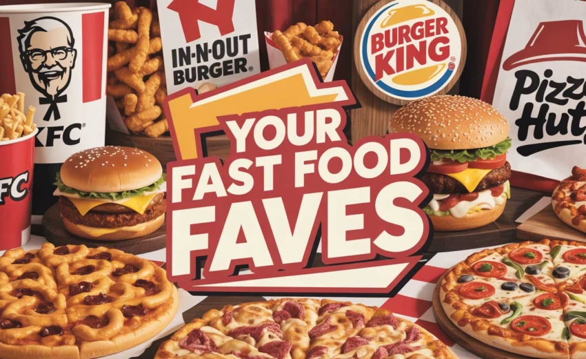
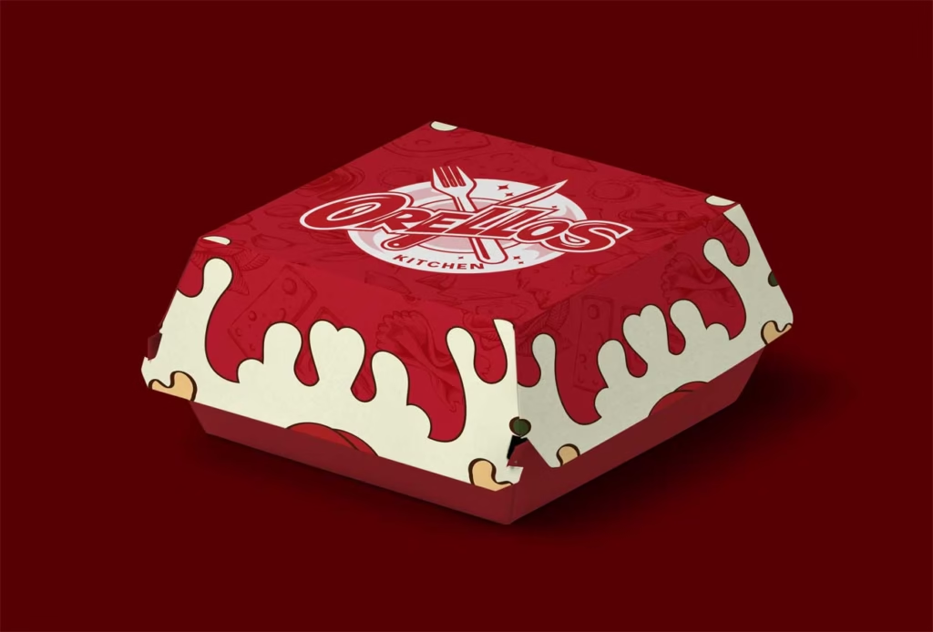
Red: The Appetite Accelerator
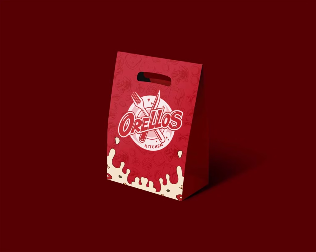
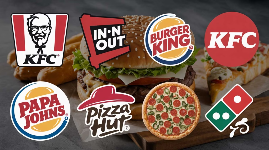
Red is one of the most powerful restaurant colors—and for good reason. It’s known to stimulate appetite, raise energy levels, and encourage faster decisions. Red increases heart rate and creates a sense of urgency, which is why it’s so common in fast-food branding.
Restaurants use red when they want customers to:
- Feel hungry quickly
- Order impulsively
- Eat faster and free up tables
- Associate the brand with excitement and bold flavor
You’ll often see red in:
- Fast food chains
- Street food brands
- Snack businesses
- Food packaging for quick consumption
However, red must be handled carefully. Too much red can feel aggressive or overwhelming, especially in fine dining or family restaurants. That’s why red works best when balanced with softer or brighter supporting colors.
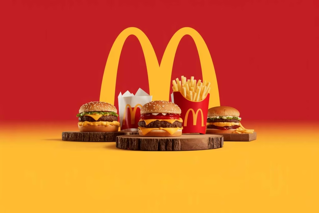
Yellow: Happiness, Speed, and Friendly Energy
Yellow is the perfect companion to red. It represents happiness, optimism, and warmth. In restaurants, yellow creates a welcoming environment and makes spaces feel lively and approachable.
Yellow is especially effective because:
- It attracts attention quickly
- It enhances feelings of joy and friendliness
- It supports fast decision-making
- It increases brand visibility from a distance
This is why many fast-food and casual dining brands use yellow in logos, interiors, menus, and signage. Yellow encourages customers to walk in, feel comfortable, and place an order without hesitation.
When red and yellow are combined, they create one of the most powerful sales-driven color combinations in the food industry.
Green: Trust, Freshness, and Health Appeal
Green is the color of nature, freshness, and balance. Restaurants focused on organic food, healthy meals, vegetarian menus, or sustainable practices rely heavily on green to communicate trust and quality.
Green works exceptionally well because it:
- Signals natural and fresh ingredients
- Reduces stress and creates calm
- Builds credibility for health-focused brands
- Appeals to eco-conscious consumers
Green is widely used by:
- Organic restaurants
- Vegan and vegetarian brands
- Juice bars and smoothie shops
- Farm-to-table dining concepts
Paired with earthy tones like beige, brown, or soft white, green creates a clean food look that feels premium yet honest.
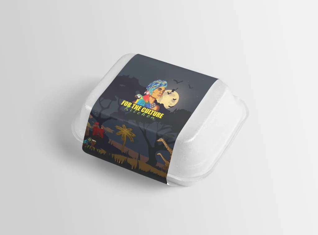
Black: Premium, Bold, and Sophisticated
Black is often misunderstood in restaurant design, but when used correctly, it can dramatically elevate brand perception. Black communicates luxury, exclusivity, and confidence. You can’t even think about how premium and luxurious your restaurant brand can be represented on a dark or black theme.
Restaurants use black to:
- Position themselves as premium
- Highlight food photography and plating
- Create strong contrast
- Enhance modern branding
Black is common in:
- Fine dining restaurants
- Steak houses
- High-end cafés
- Nighttime dining experiences
The key is balance. Black works best when paired with warm lighting, gold accents, or neutral tones to avoid making the space feel cold or uninviting.
White: Clean, Minimal, and Modern
White creates a sense of cleanliness, simplicity, and clarity. It allows food colors to stand out and makes interiors feel open and spacious.
White is effective because:
- It reinforces hygiene and quality
- It supports minimalist branding
- It highlights food presentation
- It feels modern and timeless
Restaurants often use white as a base color, layering it with accent colors to guide attention without overwhelming customers.
Orange: Energy Without Aggression
Orange blends the appetite-stimulating power of red with the friendliness of yellow. It feels energetic but less aggressive than pure red.
Orange works well for:
- Casual dining
- Family restaurants
- Cafés and bakeries
- Youth-focused food brands
It encourages social interaction and keeps the mood upbeat while still driving appetite.
Blue: Why It’s Rare in Restaurants
Blue is calming, but it’s also one of the least appetite-stimulating colors. Since blue rarely appears in natural foods, the brain doesn’t associate it with hunger.
That’s why blue is generally avoided in restaurants—except in very specific branding contexts like seafood restaurants or beverage brands, where it can suggest freshness and trust.
How Color Impacts Restaurant Sales Directly
The right restaurant colors don’t just look good—they influence business metrics.
Color affects:
- How long customers stay
- How much they order
- Whether they return
- How premium the food feels
- How memorable the brand becomes
For example:
- Fast food brands use bold colors to increase table turnover
- Fine dining uses dark, muted palettes to encourage longer stays
- Healthy restaurants use greens to justify premium pricing
Every color choice sends a psychological signal.
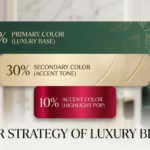
Designing Restaurant Colors That Actually Work
There’s no universal “best” color. The best restaurant colors depend on your concept, audience, and goals.
At DesignoFly, we approach restaurant color strategy by analyzing:
- Cuisine type
- Brand positioning
- Customer behavior
- Competitive landscape
- Interior and packaging needs
We don’t just pick colors—we design systems. From logo usage and menu layouts to packaging, social media visuals, and in-store branding, everything stays consistent and purposeful.
With our AI-powered design process, we test contrast, shelf appeal, and visual hierarchy before finalizing designs—something traditional agencies often miss.
Final Thoughts: Color Is a Silent Salesperson
The most successful restaurants don’t leave color to chance. They use it intentionally to sell more food, create stronger emotional connections, and stand out in crowded markets.
If your restaurant isn’t getting the attention—or sales—it deserves, your color strategy might be the missing ingredient.
At DesignoFly, we help restaurants transform color psychology into profitable branding systems that look exceptional and perform even better.