In the digital-first world of startups and technology companies, branding decisions happen fast—but their impact lasts long. Among all visual elements, tech brand colors play a decisive role in how users perceive trust, innovation, and usability. Before a product’s features are explored or its value is understood, color quietly shapes confidence and expectation.
From SaaS platforms and mobile apps to AI-driven tools and enterprise software, successful tech companies use color intentionally. The right palette signals reliability, highlights innovation, and supports clean user experiences across every digital touchpoint. When chosen strategically, tech brand colors don’t just enhance appearance—they influence adoption, engagement, and long-term growth.
Let’s explore which colors dominate tech branding, why they work, and how startups can use them strategically to stand out in competitive digital markets.
Why Color Matters So Much in Tech Branding
Technology brands operate in an environment where trust is non-negotiable. Users share personal data, rely on software for business decisions, and expect seamless experiences. Color helps communicate that trust instantly.
Beyond trust, color also influences how innovative a brand feels. A startup using outdated or poorly balanced colors can appear behind the curve—even if the technology is strong. On the other hand, a clean, modern tech palette can make even a new product feel established and credible.
Tech branding colors influence:
- First impressions of reliability
- Perceived usability of apps and platforms
- Emotional response to interfaces
- Brand memorability in crowded markets
This is why leading tech companies invest heavily in branding systems, not just logos.
Blue: The Foundation of Trust in Tech Branding

Blue remains the most dominant color in technology branding—and for good reason. Psychologically, blue is associated with trust, intelligence, stability, and security. These qualities align perfectly with what users want from tech products.
Blue works exceptionally well for:
- SaaS platforms
- Fintech companies
- Enterprise software
- Cloud services
- AI and data-driven tools
When users see blue, they subconsciously associate the brand with reliability and professionalism. This is especially important for startups trying to win trust quickly in competitive industries.
However, modern tech brands rarely use plain blue anymore. They refine it—cool blues, soft gradients, or blue paired with neutral tones—to avoid looking generic. The key is using blue strategically, not predictably.
Purple and Gradients: Innovation and Future Thinking
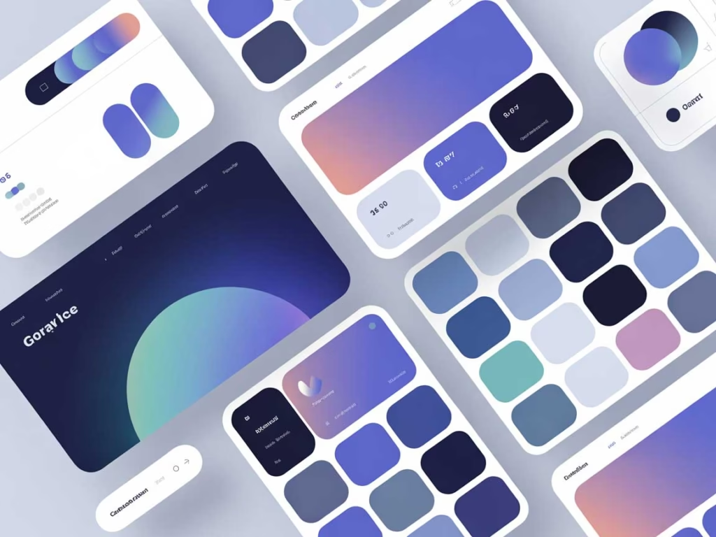
While blue builds trust, purple signals innovation. Purple sits between blue and red on the color spectrum, combining stability with creativity. This makes it ideal for startups that want to appear forward-thinking, experimental, or disruptive.
Many modern tech brands now use:
- Purple accents
- Blue-to-purple gradients
- Multicolor gradient branding
Gradients, in particular, have become a defining trend in digital branding. They suggest motion, progress, and adaptability—core values for startups and SaaS platforms.
Purple and gradient branding work well for:
- AI startups
- Creative tech platforms
- Web apps and mobile apps
- Innovation-focused products
At DesignoFly, we often recommend gradients when a startup wants to differentiate itself from traditional corporate tech brands while still maintaining a professional appearance.
Clean UI Colors: Minimalism That Builds Confidence
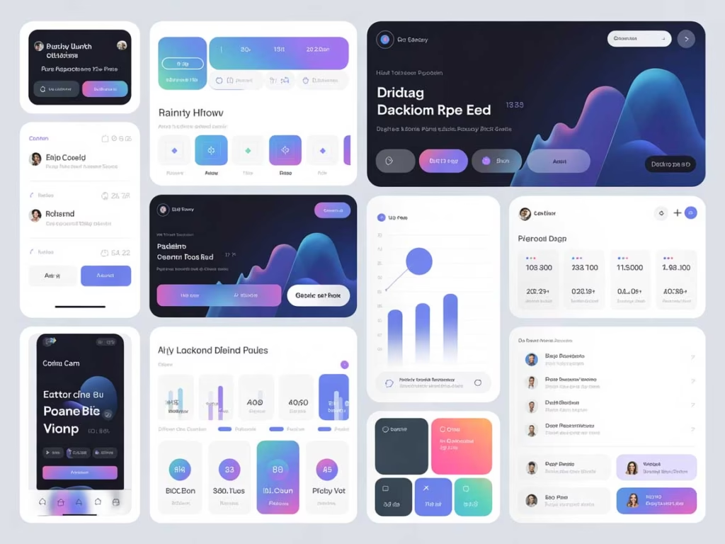
Modern tech branding isn’t just about bold colors—it’s also about restraint. Clean UI colors play a crucial role in making digital products easy to use and visually comfortable.
Neutral tones such as white, light gray, and soft backgrounds:
- Improve readability
- Reduce cognitive load
- Make interfaces feel intuitive
- Allow accent colors to stand out
Successful startups often pair a bold primary color with a clean UI base. This approach ensures the brand feels modern without overwhelming users.
Clean UI colors are especially important for:
- SaaS dashboards
- Mobile applications
- Productivity tools
- B2B software platforms
A visually calm interface builds confidence and encourages longer engagement.
Bold Accent Colors: Standing Out Without Losing Clarity
While minimalism dominates tech design, bold accent colors are still essential. These colors guide user attention and highlight key actions.
Accent colors are commonly used for:
- Call-to-action buttons
- Notifications and alerts
- Feature highlights
- Navigation elements
Popular choices include vibrant greens, electric blues, energetic oranges, or sharp teals. The key is balance—accent colors should enhance usability, not distract from it.
Startups that master this balance appear polished, user-focused, and thoughtfully designed.
App Branding Colors and User Experience

For app-based startups, color directly affects usability. Poor color contrast or overly aggressive palettes can frustrate users and reduce retention.
Effective app branding colors:
- Maintain strong contrast for accessibility
- Feel consistent across screens
- Align with the brand’s personality
- Support intuitive navigation
This is where many startups struggle. They choose colors that look good on marketing visuals but fail inside the product. At DesignoFly, we design app color systems that work across branding, UI, and marketing, ensuring consistency at every touchpoint.
Startup Colors That Scale With Growth
One of the biggest mistakes startups make is choosing colors that don’t scale. What looks trendy at launch may feel limiting as the brand grows.
Scalable startup colors:
- Work across digital and print
- Adapt to new features and products
- Support sub-brands or expansions
- Remain timeless with minor refinements
This long-term thinking separates strong brands from short-lived ones. AI-powered branding tools help test scalability early—something we integrate into our design process.
How DesignoFly Helps Tech Brands Choose the Right Colors
At DesignoFly, we don’t treat color as decoration. We treat it as a strategic asset. Our AI-powered design approach allows us to analyze industry trends, user behavior, and visual performance before finalizing color systems.
We help tech startups and digital brands with:
- Tech branding color strategy
- Startup-ready visual systems
- App and SaaS UI color design
- Gradient branding and innovation-led palettes
- Clean UI and accessibility-focused design
Whether you’re launching a startup or rebranding an existing tech product, the right colors can dramatically improve perception, engagement, and growth.
Like to know more about our services? Check out our Service Page
Final Thoughts: Color Is the Language of Tech Brands
In technology branding, color speaks before code. It tells users whether to trust you, explore further, or move on. Blue builds confidence, purple and gradients signal innovation, and clean UI colors create clarity.
The most successful tech brands understand this balance—and apply it consistently across every digital touchpoint.
If your tech brand needs colors that don’t just look modern but actually work, strategic design is the difference between blending in and leading the market.
January 20, 2026
Understanding Abstract Mark Logos: Definition, Uses, Pros, and...
January 20, 2026