In the modern commercial landscape, the battle for consumer loyalty and premium market positioning is not fought solely on the merits of a product or the bullet points of a service agreement. It is waged, and won, in the subconscious mind of the buyer within the first fleeting milliseconds of visual contact. Over the course of two decades spent analyzing brand narratives, consumer psychology, and market dynamics, one truth has remained absolute: the difference between a brand that competes on price and a brand that commands premium authority comes down to visual discipline.
The marketplace is overflowing with chaotic, unrefined visual identities. To transcend this noise and establish your business as the undisputed, elite authority in your specific industry, you must master the profound psychology of aesthetics. At the very heart of this mastery is a closely guarded framework utilized by the world’s most prestigious graphic design agencies: the 60-30-10 color rule.
This comprehensive guide is a deep dive into the business mechanics of visual hierarchy, graphic design strategy, and the profound psychological meaning of color. We will explore exactly why elite luxury brands like Rolex and Apple rely on the precise 60-30-10 architecture, how different industries manipulate color to drive specific consumer behaviors, and how establishing a rigorous, professional color palette transforms a business into a high-converting, premium brand.
The Deep Psychological Meaning of Color in Branding
Before we deconstruct the mathematical ratio of the 60-30-10 rule, we must first understand the raw materials we are working with. Color is not merely a decorative choice; it is a psychological trigger. It is the silent ambassador of your brand, communicating your core values, your price point, and your market position before a prospective client reads a single word of your copy.
Human beings are hardwired to react to specific hues on a neurochemical level. When an expert graphic designer builds a brand identity, they are essentially engineering an emotional response.
- Black: The ultimate color of luxury, sophistication, and absolute authority. When used heavily, it strips away distractions and communicates a commanding, uncompromising presence.
- White: Represents purity, clarity, and expansive space. In high-end graphic design, white space (or negative space) is the ultimate luxury. It signals that a brand is confident enough not to fill every inch with noise.
- Blue: The universal color of trust, intellect, and security. Deep navy blues are foundational for corporate, legal, and financial institutions that require their clients to feel completely safe making high-stakes decisions.
- Green: Inherently tied to nature, tranquility, and wealth. Deep, saturated greens communicate heritage, financial prosperity, and enduring value, while lighter greens signify organic growth and vitality.
- Red: A highly visceral color that increases the heart rate and triggers urgency, passion, and appetite. It is a dominant force that demands immediate attention and action.
- Yellow: The color of optimism, youth, and visibility. It is the first color processed by the human eye, making it incredibly effective for grabbing attention from a distance.
- Metallics (Gold, Silver, Platinum): These are not just colors; they are psychological symbols of prestige, accomplishment, and premium monetary value. They instantly elevate the perceived cost of a product or service.
When a brand randomly mixes these psychological triggers, it creates cognitive dissonance. The consumer’s brain is confused by conflicting emotional signals, leading to mistrust. However, when these colors are orchestrated through the precise discipline of the 60-30-10 rule, they create an irresistible, harmonious narrative.
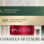
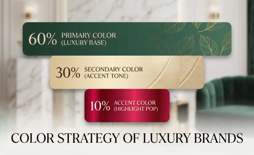
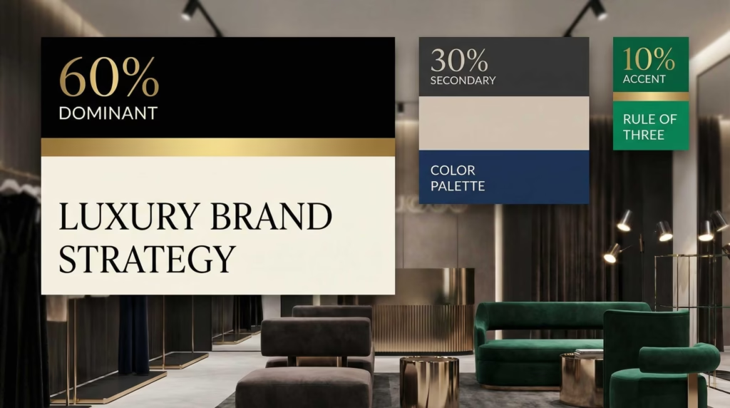
Deconstructing the 60-30-10 Rule: The Blueprint of Visual Hierarchy
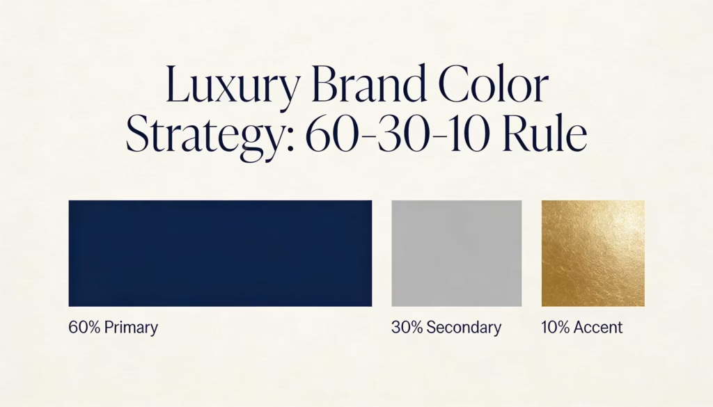
The 60-30-10 rule dictates that a premium brand’s color palette should never be applied in equal or random measures. Instead, colors are assigned strict, uncompromising percentages of the total visual real estate across all graphic design assets—from physical packaging and print collateral to digital brand guidelines.
1. The 60% Dominant Color: The Foundation of Atmosphere
The dominant color is the bedrock of your brand identity. It claims 60% of your visual space, serving as the expansive canvas upon which your entire brand narrative is built.
In the luxury sector, this dominant color is almost universally a sophisticated neutral. By dedicating the majority of your visual space to a unified, calming color, you project supreme market stability. It tells the prospective client that your business does not need to use flashy gimmicks to prove its worth. It establishes the “room” the consumer is walking into—whether that room is a stark, modern white gallery or a deep, moody, exclusive club.
2. The 30% Secondary Color: The Architecture of Narrative
The secondary color occupies 30% of your brand’s visual presence. Its critical role is to provide essential structure, depth, and vital contrast without ever overpowering the primary 60% foundation.
The 30% color builds your brand’s unique personality. It is distinct enough from the dominant color to be immediately noticed, yet harmonious enough to feel like an organic extension of the brand family. In professional graphic design, this color is utilized for structural organization—think elegant typography, secondary graphical elements in a brochure, or the distinct packaging material that houses a luxury product.
3. The 10% Accent Color: The Catalyst for Conversion
This is where visual psychology directly intersects with business performance. The accent color comprises only a mere 10% of your total design, yet it wields the highest visual gravity of the entire palette. Because it is deployed with such severe scarcity, the human eye is magnetically and involuntarily drawn to it.
The accent color is the deliberate anomaly. In luxury branding, these 10% accents are often striking metallics, rich jewel tones, or highly confident hues. This color is strictly reserved for the most important visual elements: the primary logo mark, a vital call-to-action, or the signature detail on a physical product. By limiting its use, the brand creates a sense of profound exclusivity and effortless focus.
Case Studies in Prestige: Rolex and Apple
To truly understand the power of this graphic design methodology, we must examine the titans of luxury. These brands do not just use color; they own it in the minds of the consumer.
Rolex: The Heritage of Green and Gold
Rolex is the undisputed king of luxury timepieces, and their brand identity is a masterclass in the 60-30-10 rule and the psychology of color.
- The 60% Foundation: While one might assume green is their dominant color, in their broader brand application (magazine spreads, retail boutiques, and high-end print collateral), the 60% is actually comprised of expansive, rich neutrals. Deep, moody blacks, slate grays, or stark, premium whites provide the vast negative space required to make the product shine. This communicates timelessness and unshakeable authority.
- The 30% Structure: The iconic “Rolex Green” (a deep, emerald hue communicating immense wealth, heritage, and prosperity) acts as the 30% secondary structural color. It is used for their luxurious leather watch boxes, specific structural elements in their advertisements, and retail signage. It grounds the brand in its rich history.
- The 10% Accent: The metallic Rolex Gold. Used with surgical precision, the gold is reserved strictly for the iconic five-pointed crown logo and the delicate typography denoting the brand name. When placed against the 60% dark neutrals and the 30% rich green, that 10% flash of gold instantly registers in the human brain as the ultimate symbol of success and prestige.
Apple: The Ultimate Minimalist Luxury
Apple revolutionized not just technology, but the aesthetic of modern premium branding. Their approach to the 60-30-10 rule is the definition of visual discipline.
- The 60% Foundation: Uncompromising, expansive White. Apple uses white space more aggressively than almost any other brand on the planet. This 60% foundation strips away all visual noise, communicating absolute purity, cutting-edge modernity, and an effortless user experience.
- The 30% Structure: Sleek Silver, Space Grey, and crisp Black. These colors form the structure of their brand identity. They are used for the typography that delivers their precise messaging and the physical metallic bodies of their products. It feels clinical, intelligent, and profoundly premium.
- The 10% Accent: The vibrant, high-definition colors of the screens and product imagery itself. In Apple’s marketing, the only true “color” you see is usually the wallpaper on the iPhone being advertised or a small, vibrant interactive button. Because the rest of the visual field is entirely monochromatic, that 10% splash of vivid color commands 100% of the viewer’s attention.
The Power of Color in Action: The Fast Food Contrast
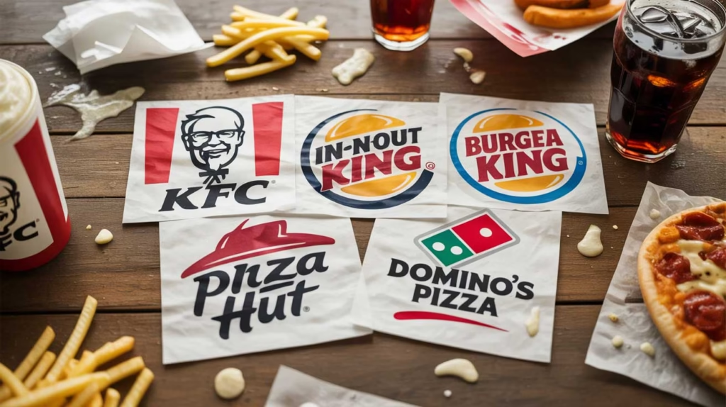
To fully grasp how color rules dictate consumer behavior, it is highly instructive to look outside the luxury sector. Graphic design is about engineering a specific outcome, and no industry does this more aggressively than the fast-food sector. Let us examine McDonald’s.
If luxury branding is about slowing the consumer down and making them feel exclusive, fast-food branding is about speed, volume, and urgency.
- The Psychology of the Palette: McDonald’s does not use calming neutrals. They utilize a high-octane combination of Red and Yellow. As established in our psychological primer, red increases the heart rate, stimulates the appetite, and creates a subconscious sense of urgency. Yellow is the most visible color in daylight, triggering feelings of rapid energy and drawing the eye from miles away on a highway.
- The 60-30-10 Application: In their classic branding, Red is the 60% dominant foundation (used heavily on building exteriors, packaging, and trays). Yellow acts as the 30% structural color (the massive Golden Arches, the French fry boxes). The 10% accent is relegated to stark White or Black for the text.
If a luxury brand attempted to use McDonald’s color palette, they would instantly destroy their premium positioning. The high-contrast, primary colors scream “fast and cheap.” Conversely, if McDonald’s rebranded using Rolex’s dark neutrals and subtle gold, customers would subconsciously feel the food was too expensive or the service too slow. This dramatic contrast proves that color palette selection is a functional business tool that dictates how your company operates in the marketplace.
Selecting the Relevant Palette for Your Specific Industry
Understanding the deep meaning of color allows you to strategically select a 60-30-10 palette that perfectly aligns with your industry and target demographic. A color strategy must be tailored specifically to the psychological needs of the buyer within a given sector.
1. The High-End Corporate and Financial Sector A wealth management firm or B2B enterprise must project impenetrable trust, absolute discretion, and razor-sharp intellect.
- 60% Dominant: Deep, authoritative Navy Blue or Midnight Charcoal. This foundation feels inherently corporate, highly secure, and deeply established.
- 30% Secondary: Crisp, pristine White or Soft Silver. Utilized for expansive typography, clean data visualization, and readable financial reports.
- 10% Accent: Brushed Platinum or a striking Electric Blue. Used exclusively for subtle logo embossing and vital contact prompts.
2. The Boutique Real Estate and Architectural Firm Selling exclusive properties or bespoke architectural design requires a visual identity that makes the buyer feel they are investing in a permanent legacy.
- 60% Dominant: Warm, textural Stone Gray or expansive Architectural White. This roots the brand in the physical world, creating a feeling of permanence and pristine cleanliness.
- 30% Secondary: Deep Onyx Black or Rich Espresso. Deployed to define sophisticated borders in print brochures and organize complex property details.
- 10% Accent: Brushed Brass or muted Gold. Applied with extreme restraint to the firm’s logo and key architectural highlights, whispering wealth and exclusivity.
3. The Premium Organic and Wellness Brand A luxury spa or high-end organic skincare line must make the consumer feel rejuvenated and pure the moment they interact with the packaging.
- 60% Dominant: Soft Cream or Warm Alabaster. Stark white can feel too clinical; cream feels soft, organic, and inviting.
- 30% Secondary: Muted Sage Green or Earthy Taupe. This connects the brand directly to nature and holistic healing.
- 10% Accent: Warm Copper or Deep Terracotta. Used for the logo foil stamping and key product names, adding an earthy, yet highly refined, touch of luxury.
The DesignoFly Advantage: Translating Theory into High-End Graphic Design
Understanding the profound psychology of the 60-30-10 framework is only the genesis of building a luxury brand. Executing it flawlessly across a complex, multi-channel business ecosystem is where true market leaders are forged. The most expensive mistake a growing business can make is attempting to implement premium branding in-house without the required strategic discipline or typographic expertise.
Founders often fall prey to emotional attachment, clinging to a chaotic mix of colors simply because “they like them.” The inevitable result is a fragmented, diluted brand identity that confuses the consumer. When your logo, your corporate brochures, and your brand guidelines look disjointed, your prospective clients will implicitly expect a discount.
True premium market positioning requires an objective, highly experienced approach to visual architecture. It requires the trained eye to balance negative space, the unyielding discipline to adhere to the 60-30-10 ratios, and the typographic mastery to ensure your brand speaks with authority.
This is exactly where DesignoFly steps in as the definitive catalyst for your brand’s evolution.
Operating from our studio in Rajbari, Bangladesh, we have spent over 9 years delivering world-class, high-end graphic design solutions to a global clientele. We do not simply create aesthetically pleasing graphics; we engineer robust brand identities that serve as the financial engine of your company. While we offer comprehensive digital services, including UI/UX and WordPress web development as secondary support channels to ensure your brand lives flawlessly online, our true heart, soul, and primary expertise lie in pure, strategic graphic design and brand architecture.
When you partner with DesignoFly to elevate your visual identity, you gain immediate access to elite branding services:
- Strategic Brand Identity & Logo Design: We do not guess what looks premium; we engineer it. We craft a bespoke, psychology-driven color architecture utilizing the rigorous 60-30-10 rule, ensuring your primary logo mark and visual foundation project the exact level of prestige required to capture high-ticket clientele.
- Comprehensive Brand Guidelines: Consistency is the uncompromising key to premium positioning. We provide highly detailed architectural blueprints for your brand. This document dictates exactly how your new visual identity is applied across every conceivable medium, ensuring that your luxury standard is never diluted by inconsistent application.
- High-Impact Print and Promotional Design: From sophisticated corporate profiles and physical packaging to expansive promotional marketing campaigns, we ensure your new luxury aesthetic is flawlessly integrated. We meticulously balance your 60-30-10 palette with premium typography to create physical and digital assets that demand respect.
Step into Your Premium Market Positioning
You have poured your time, capital, and expertise into building a business that delivers exceptional quality. It is time your brand’s visual identity caught up to your reality. Stop allowing an unrefined, chaotic graphic design aesthetic to cost you lucrative, high-value contracts and the premium pricing power you have rightfully earned.
By fully leveraging the proven, scientifically backed psychology of the 60-30-10 color rule, you can systematically transform your brand from just another option in a crowded marketplace into the undeniable, luxury choice for your industry. It requires bold strategic vision, strict mathematical discipline, and expert, agency-level execution.
At DesignoFly, we are ready to architect that exact transformation. Let us handle the complex psychology of color theory, the intricate demands of brand narrative, and the highly technical graphic design execution required to position your business at the absolute pinnacle of your industry.
Your next high-ticket client is already evaluating your worth based entirely on your visual presence. Make sure you are projecting absolute authority and uncompromising quality. Reach out to the branding experts at DesignoFly today, and let us build the premium visual identity your business truly deserves.

February 24, 2026
The Strategic Use of Tech Brand Colors in...
February 24, 2026