Executive SummaryBrand identity is the tangible visual and verbal system—including logos, color architecture, typography, and messaging—that translates a company’s strategy into recognizable market presence. This comprehensive guide breaks down how to build an authoritative visual identity that commands premium pricing, fosters customer trust, and scales seamlessly across digital and physical touchpoints.
In an increasingly crowded global marketplace, your business is evaluated within milliseconds of visual contact. Long before a customer reads your value proposition, tests your software, or speaks with your sales team, they form an instinctive judgment about your credibility, quality, and pricing tier based entirely on your brand identity.
What Exactly Is Brand Identity? (Brand vs. Branding vs. Brand Identity)
To build an enduring business asset, you must first clarify a fundamental distinction that confuses many founders and marketing teams: the difference between your brand, your branding, and your brand identity. While these terms are frequently used interchangeably in casual conversation, in professional design and commercial strategy, they represent three distinct dimensions of your business.
← Scroll horizontally on mobile →
| Concept | Definition | Core Question | Control |
|---|---|---|---|
| The Brand | The collective emotional perception, gut feeling, and reputation held in the minds of your audience. | “Who do people feel we are?” | The Customer / Market |
| Branding | The active, ongoing strategic process of shaping customer perceptions through positioning and marketing. | “How do we influence their perception?” | The Business Strategy |
| Brand Identity | The tangible collection of visual, verbal, and sensory elements created to represent the brand consistently. | “What does the brand look, sound, and feel like?” | The Design & Identity System |
Think of your brand as your company’s overall personality and reputation, branding as the actions you take to build that reputation, and brand identity as the physical wardrobe, voice, and signature look that makes you immediately identifiable in any room.
Without a deliberate brand identity, your market reputation is left entirely to chance. A cohesive visual identity bridges the gap between what you stand for internally and how you are perceived by high-ticket clients externally.
“A logo is merely the front door to your business; a brand identity is the complete architectural structure that makes people want to stay and do business with you.”
The 5 Core Components of a High-Impact Visual Identity System
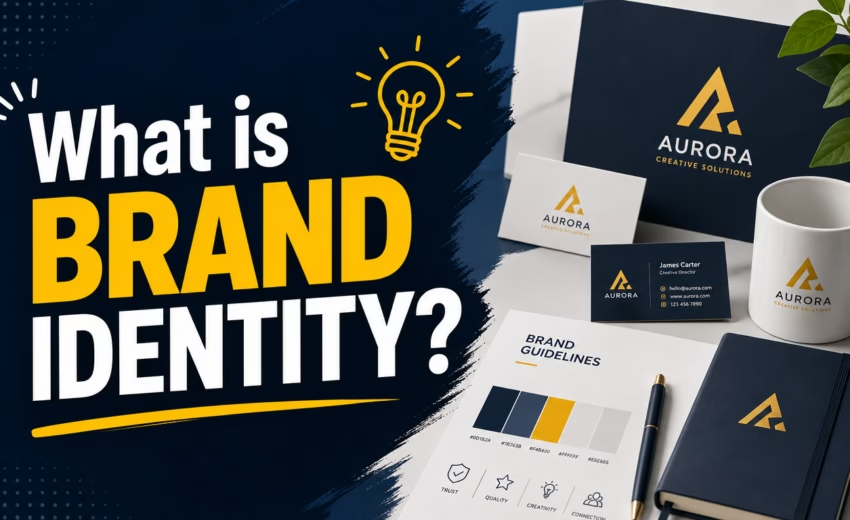
A professional brand identity design is not a single graphic file. It is a harmonious ecosystem of interconnected visual tools engineered to work across physical packaging, digital user interfaces, print collateral, and marketing campaigns. Below are the five essential pillars that constitute a complete visual identity system:
1. Logo Architecture (Primary, Secondary, and Marks)
A resilient brand never relies on a single, rigid logo file. Modern businesses operate across diverse form factors—from massive billboard headers to tiny 16×16 pixel browser favicons and mobile app headers. A professional logo system includes:
- Primary Logo: The main, full-format visual signature featuring the brand name and primary emblem, utilized on desktop headers, pitch decks, and hero marketing assets.
- Secondary / Horizontal Logo: A streamlined layout optimized for constrained horizontal spaces, such as sticky navigation bars and invoice headers.
- Submark / Logomark: A compact, standalone symbol (such as an icon or monogram) designed for social media profile avatars, app icons, and merchandise stamping.
- Clear Space & Exclusion Zones: Strict mathematical rules governing the minimum padding required around the logo to prevent visual clutter and maintain legibility.
2. Strategic Color Palette Hierarchy (The 60-30-10 Architecture)
Color is the most immediate neurochemical trigger in visual communication. It conveys price point, industry authority, and emotional resonance before a single line of copy is read. Rather than combining random hues, elite brand systems follow disciplined mathematical ratios:
- 60% Dominant Foundation: The foundational neutral canvas (such as deep dark neutrals, architectural slates, or expansive whites) that anchors your assets and provides essential visual breathing room.
- 30% Secondary Structural Color: The supporting hue that builds depth, defines typographic elements, and provides contrast across card containers and backgrounds.
- 10% Accent Catalyst: A high-energy, confident accent (such as DesignoFly’s Electric Lime
#6cd445) deployed with strict scarcity for primary call-to-actions, vital indicators, and focal highlights.
3. Brand Typography System
Typography is the vocal posture of your brand in written form. A corporate enterprise requires stability and geometric precision, while an artisanal luxury studio demands refined editorial elegance. A professional typographic hierarchy defines:
- Primary Headline Font: Bold, expressive typography (such as Inter or modern display sans-serifs) that commands immediate visual authority.
- Body & Subheading Font: Highly legible, comfortable typography (such as DM Sans or classic grotesques) optimized for prolonged reading across mobile and desktop displays.
- Scale & Line-Height Standards: Explicit rules for font sizes, weight variations, letter-spacing (tracking), and line heights across H1, H2, H3, body, and caption tiers.
4. Graphic Elements, Patterns, and Iconography
Beyond logos and typography, distinctive brands possess recognizable secondary assets. These include custom geometric patterns, bespoke icon sets, textural treatments, and directional arrows that make an advertisement or brochure instantly recognizable even if the logo is removed.
5. Imagery Style & Art Direction
Whether your brand utilizes custom 3D illustrations, crisp product photography, or human-centric documentary portraits, your brand identity must establish clear rules regarding lighting, saturation, subject matter, and overlay treatments to maintain visual continuity.
Beyond the Visuals: Verbal Identity & Strategic Messaging
While visual design creates the immediate emotional spark, your verbal identity sustains the relationship and converts interested readers into loyal clients. A complete brand identity integrates visual assets with strategic narrative frameworks:
Tone of Voice (How You Speak)
Your tone of voice defines your company’s communication style across customer support emails, marketing landing pages, and social media commentary. Is your brand authoritative and consultative? Playful and conversational? Minimalist and clinical?
Establishing clear tonal guardrails prevents inconsistent customer experiences. When your website copy sounds academic but your sales reps sound ultra-casual, prospective buyers sense an underlying lack of operational maturity.
Mission, Vision & Core Value Architecture
A brand identity is only as strong as the conviction behind it. Your mission articulates what you do and who you serve today; your vision defines where you are leading the market tomorrow; and your core values establish the non-negotiable principles that guide design decisions, product development, and client relationships.
“Design without strategic messaging is mere decoration. Messaging without design is invisible. True brand equity exists at the exact intersection of both.”
Real-World Business Touchpoints: Where Your Brand Identity Lives
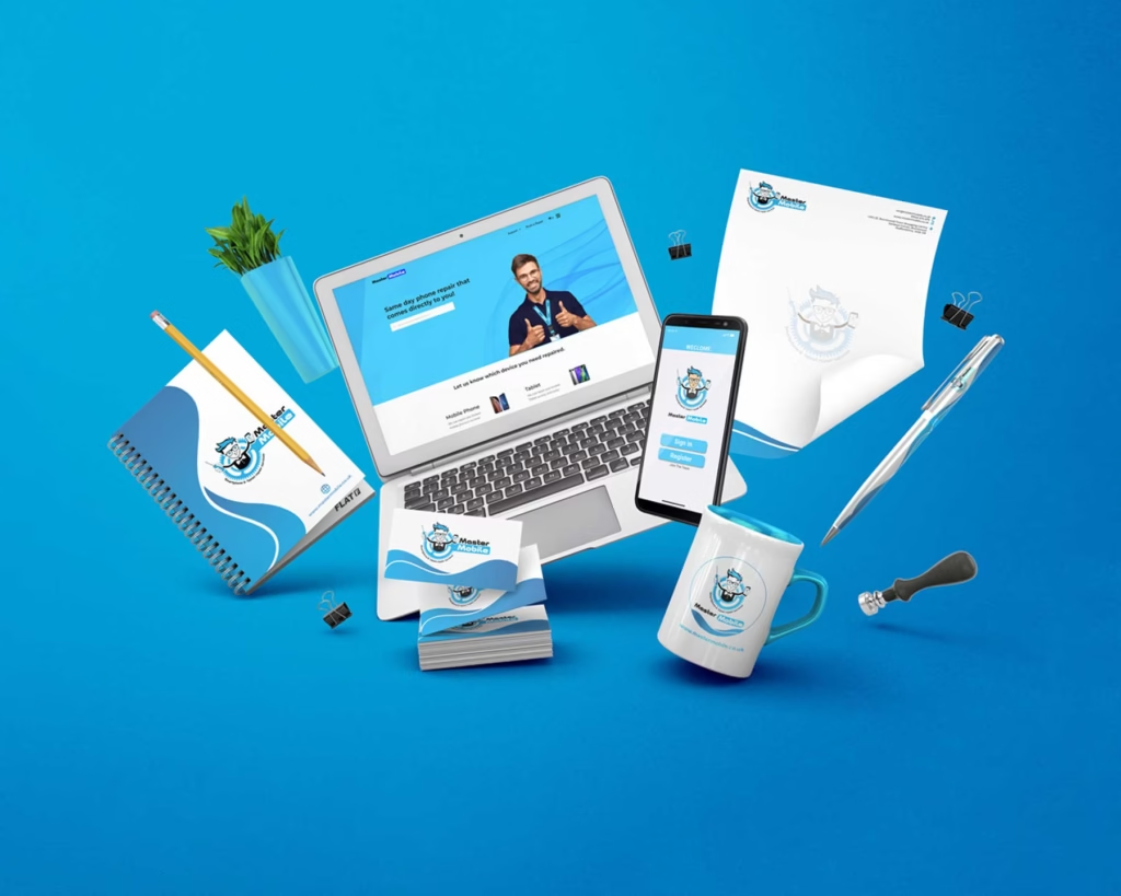
A robust brand identity must function reliably in the real world across every point of customer interaction. When evaluating your visual presence, consider how seamlessly your identity translates across these critical commercial touchpoints:
- Digital Ecosystem: Custom responsive website, web app interfaces, interactive mobile apps, email newsletter templates, social media banners, and digital advertising campaigns.
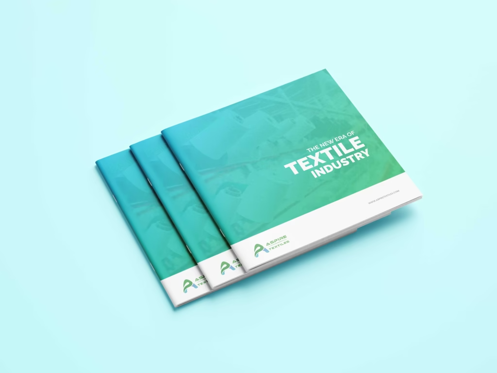
- Physical & Print Collateral: Premium corporate stationery, foil-stamped business cards, multi-page company profiles, presentation folders, brochures, and exhibition banners.
- Product & Packaging: Custom packaging boxes, product labels, tissue wraps, unboxing cards, and shipping cartons that elevate the tangible customer experience.
- Corporate & Sales Assets: Pitch deck presentations, client proposals, contract documents, service rate cards, and user documentation.
The Bridge: Turning an AI-Generated Logo into a Complete Brand System
In today’s fast-moving business landscape, an increasingly common scenario has emerged: a founder or startup team uses an AI design tool or logo generator to brainstorm an initial visual concept. They receive a single PNG or JPEG icon and believe they have completed their branding.
However, when they attempt to print stationery, launch a responsive website, format an investor deck, or manufacture physical packaging, the limitations become immediately apparent:
- No Vector Scalability: Raster image files pixelate and blur when scaled for signage, print brochures, or high-resolution displays.
- Lack of Variations: A single square mark cannot adapt to horizontal website headers, mobile app headers, or monochrome embroidery.
- Missing System Components: A standalone graphic provides no color hierarchy, no font pairings, no spacing rules, and no collateral guidelines.
This is where professional design expertise provides immense commercial value. At DesignoFly, we frequently partner with businesses that have an initial AI-assisted logo concept and want to transform that raw starting point into a complete, usable, and scalable brand identity system.
We refine the geometry, recreate vector master files, engineer a cohesive 60-30-10 color palette, select accessible typography, establish spacing rules, and build out complete stationery and digital brand guidelines. AI can spark an idea; professional human design turns that idea into a commercial brand engine.
“An isolated graphic is not a brand system. Professional branding transforms visual concepts into production-ready assets built to scale.”
Dribbble Design Feed
UI/UX Concepts & Motion Interactions
Explore micro-animations, mobile app interfaces, and modern visual experiments on our official Dribbble stream.
Brand Guidelines: The Armor That Protects Your Market Value
The greatest risk to any brand identity is gradual dilution. When multiple team members, external marketing agencies, web developers, and print vendors create assets without strict rules, visual inconsistency quickly erodes customer trust.
A comprehensive Brand Style Guide (Brand Guidelines) is the rulebook that protects your brand equity. It serves as the single source of truth for your entire organization, detailing:
- Correct Logo Usage: Proper placement, background contrast rules, minimum sizing, and explicit “What NOT to do” examples (such as stretching, rotating, or altering colors).
- Exact Color Formulas: Precise values across digital (HEX, RGB) and print (CMYK, Pantone/PMS) to guarantee exact color matching across every screen and physical material.
- Typography Hierarchy: Exact font weights, sizes, and line-heights for web development and print layouts.
- Grid Systems & Layout Rules: Compositional frameworks for corporate brochures, digital advertisements, and social media carousels.
Practical Brand Identity Health Checklist: Rate Your Visual Authority
Is your current brand identity helping you win premium clients, or is it subtly costing you revenue? Use this practical diagnostic checklist to audit your visual health:
← Scroll horizontally on mobile →
| Brand Dimension | Strong Brand Identity (High Value) | Weak / Fragmented Identity (High Risk) |
|---|---|---|
| Logo Scalability | Full vector suite (SVG, EPS, AI) with primary, horizontal, and submark variations. | Single low-res PNG/JPG that blurs on print or doesn’t fit mobile headers. |
| Color Architecture | Disciplined 60-30-10 palette with standardized HEX, RGB, and CMYK values. | Random colors selected ad-hoc with inconsistent shades across web and print. |
| Typography | Standardized primary and secondary fonts with clear hierarchy across all media. | Random default system fonts mixed inconsistently across decks and websites. |
| Brand Guidelines | Comprehensive Brand Style Guide referenced by all team members and vendors. | No documented rules; design decisions depend on individual employee preferences. |
| Customer Perception | Projects authority, justifies premium pricing, and fosters immediate trust. | Competes primarily on price; clients implicitly expect discounts. |
Frequently Asked Questions About Brand Identity
Q1: What is the primary difference between a brand identity and a visual identity?
A visual identity encompasses only the graphical elements you see (logos, colors, typography, iconography, and layouts). A complete brand identity is broader—it combines that visual identity with non-visual elements such as your brand voice, core values, messaging framework, and customer experience touchpoints.
Q2: Can a business build a scalable brand identity starting with an AI-generated logo?
Yes, provided the AI logo is treated as a conceptual starting point rather than a final asset. A professional design partner can clean and vectorize the geometry, build complementary horizontal and submark variations, engineer a 60-30-10 color hierarchy, pair matching typography, and assemble a comprehensive brand kit and style guide.
Q3: How long does it typically take to develop a professional brand identity?
A comprehensive brand identity project typically takes between 2 to 4 weeks. This timeframe encompasses market research, concept development, typography and color architecture, touchpoint testing, collateral design (stationery, social kits), and compiling the official Brand Guidelines.
Q4: What file formats should a client receive upon brand identity completion?
You should receive vector master files (AI, EPS, SVG, and PDF) for unlimited resolution scaling, along with optimized raster formats (high-res PNG with transparent backgrounds, WebP/AVIF for web speed, and JPEG) in full color, inverted white, and single-color black versions.
Q5: How does a strong brand identity impact business valuation and pricing power?
Visual discipline directly reduces perceived risk in the mind of the buyer. High-end visual architecture signals operational maturity, financial stability, and superior service quality, enabling companies to command 2x to 10x higher pricing compared to competitors with fragmented or generic branding.
Q6: When should a company consider a brand identity redesign or refresh?
A redesign is necessary when: your business has outgrown its original positioning, you are expanding into international or enterprise markets, your visual assets look dated across modern mobile devices, or your visual identity fails to reflect the true quality of your current offerings.
Key Takeaways & Conclusion
Your brand identity is one of the few foundational business assets that appreciates in value over time. By investing in disciplined visual architecture, mathematical color hierarchy, and documented brand guidelines, you establish an unmistakable market authority that attracts qualified clients and powers sustainable commercial growth.
Step into Your Premium Market Positioning
With 9+ years of experience and over 7.8K+ completed projects, DesignoFly engineers bespoke brand identities that capture high-ticket clientele.


September 1, 2026