Executive SummaryBrand colors are the single most influential visual trigger in commercial branding, directly dictating how potential clients evaluate your credibility, pricing tier, and industry authority within milliseconds. This comprehensive guide moves beyond simplistic color clichés to explore the real science of color psychology, mathematical palette architecture, industry archetypes, WCAG digital accessibility, and cross-medium print calibration.
In visual commerce, color is never decorative. Long before a customer reads your headline, evaluates your service features, or speaks with your sales team, your brand colors trigger subconscious emotional associations that either build instinctive trust or introduce cognitive friction.
The Reality of Brand Colors: Perception, Context, and Color Psychology De-Hyped
Pop-culture branding advice often reduces color psychology to childish formulas: “blue means trustworthy, red means energetic, green means organic.” In the real commercial world, color psychology is vastly more nuanced and context-dependent. A prospective buyer does not choose an enterprise software platform simply because its logo is blue, nor do they hire an elite law firm because of a psychological trick.
Academic research in sensory marketing reveals that customer reaction to color depends almost entirely on perceived appropriateness. Does the color scheme feel right for what the business sells, the price point it commands, and the culture of its audience? If an enterprise cybersecurity provider utilizes pastel bubblegum pink, consumers feel immediate apprehension—not because pink is an inferior color, but because it violates the established category codes of stability, data security, and institutional gravity.
Furthermore, visual perception relies heavily on the Isolation Effect (the Von Restorff effect). Humans naturally remember items that stand out from their surroundings. In branding, an accent color does not operate in a vacuum; its psychological impact is dictated entirely by the foundational canvas that surrounds it. As explored in our comprehensive brand identity guide, a cohesive visual system creates meaning through contrast, hierarchy, and intentional restraint.
“Color psychology is not magic; it is the strategic management of customer expectations. The right brand colors do not force emotion—they confirm credibility.”
The 60-30-10 Architecture: How High-End Brands Build Balanced Palettes
The most common mistake amateur designers and early-stage founders make when creating a brand color palette is selecting five equally vibrant colors and deploying them haphazardly across their website, packaging, and marketing collateral. When every element screams for attention, nothing gets heard.
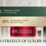
World-class branding agencies structure brand palettes around the architectural 60-30-10 Rule, a mathematical ratio originating in interior architecture that establishes effortless visual harmony:
1. 60% — The Dominant Foundational Canvas
This is the overarching neutral background that anchors 60% of your visual presence. In modern dark-mode luxury branding (such as DesignoFly’s signature aesthetic), this foundation consists of deep, immersive blacks and charcoal containers (#070707 and #131313). In minimalist corporate systems, it may be architectural warm whites or subtle alabaster. The foundational canvas provides visual breathing room and prevents sensory fatigue.
2. 30% — The Structural Brand Color
The secondary color creates structural contrast, defines card borders, provides depth to illustrations, and frames typography. It complements the dominant foundation without competing for primary focus. In high-end tech, this is often a deep slate, muted gunmetal, or refined neutral grey that establishes hierarchy.
3. 10% — The High-Impact Conversion Accent
Deployed with absolute scarcity, this high-energy accent color represents precisely 10% of your visual touchpoints. Reserved exclusively for primary call-to-action buttons, key data visualization peaks, active indicators, and focal highlights, the accent draws the human eye exactly where commercial conversion takes place. Overusing an accent color destroys its conversion power.
Industry Color Archetypes: What Top Global Brands Signal Through Color
Every commercial sector operates under established visual grammar. Understanding how premier global corporations leverage brand colors provides a strategic framework for choosing whether your business should align with industry conventions or deliberately disrupt them:
← Scroll horizontally on mobile →
| Industry | Dominant Palette Archetypes | Representative Brand Examples | Psychological Signal |
|---|---|---|---|
| Tech & Cloud Infrastructure | Deep Blues, Slate, Vibrant Orange & Cyan | AWS, Adobe, Claude AI, Canva | Architectural reliability, infinite scale, cognitive clarity |
| Luxury, Fashion & Automotive | Monochrome Obsidian, Silver, Rich Cream | Chanel, BMW, Audi, Apple | Unapologetic prestige, timelessness, high pricing tier |
| Food, Beverage & Fast Casual | Warm Reds, Radiant Yellows, Rich Browns | Burger King, McDonald’s, Coca-Cola | Appetite stimulation, speed, warmth, immediate visibility |
| Academia, Healthcare & Civic | Navy Blue, Institutional Gold, Clean Teals | UC Berkeley, Mayo Clinic, Pfizer | Ethical rigor, tradition, intellectual permanence |
| Eco, Wellness & Sustainability | Sage Green, Terracotta, Natural Oat neutrals | Patagonia, Whole Foods, Aesop | Environmental stewardship, clean vitality, honesty |
Notice how luxury leaders like Chanel and Apple rely almost entirely on monochromatic black and white. By intentionally stripping away saturated chromatic hues, they force the consumer to focus on form factor, material quality, and silhouette. The absence of bright color becomes the ultimate symbol of high-status restraint.
“In premium branding, color restraint projects confidence. Budget brands shout with loud saturation; elite brands whisper with disciplined neutrality.”
Cross-Medium Color Calibration: The Technical Realities of HEX, RGB, CMYK & Pantone
A brand color palette that looks breathtaking on an OLED monitor can fail catastrophically when applied to an offset-printed corporate brochure or corrugated cardboard packaging. This occurs because digital displays and physical printers generate color through two completely opposite physics principles:
- RGB (Red, Green, Blue) & HEX: Additive color models used exclusively for illuminated digital screens (websites, software apps, social media graphics). By combining light beams, RGB can reproduce ultra-vibrant, glowing neon hues (such as electric lime
#6cd445or electric cyan). - CMYK (Cyan, Magenta, Yellow, Key/Black): Subtractive color model used in commercial four-color process printing. Light reflects off physical paper, and inks absorb specific wavelengths. Because inks cannot emit light, CMYK has a substantially narrower color gamut than RGB. Super-saturated digital greens and blues often turn dull and muddy in standard CMYK.
- Pantone Matching System (PMS): Standardized spot-color inks mixed to exact chemical formulas before going onto the press. When a brand requires exact color reproduction across international print runs, branded apparel, or luxury packaging boxes, Pantone inks guarantee 100% color fidelity regardless of the printing facility.
Professional brand designers never deliver a single HEX code and assume the job is finished. A production-ready brand style guide provides calibrated, mathematically verified conversions for HEX, RGB, CMYK, and Pantone to ensure flawless brand recognition across all mediums.

Digital Accessibility & WCAG Contrast: Why Beautiful Colors Must Be Readable
A visual identity that excludes users with vision impairments is bad design and bad business. The Web Content Accessibility Guidelines (WCAG 2.1) establish clear contrast thresholds that ensure digital interfaces remain accessible to people with low vision, contrast sensitivity deficits, or color vision deficiency (color blindness):
- WCAG AA Standard (Minimum): Requires a contrast ratio of at least 4.5:1 for normal body text and 3.0:1 for large text (18pt or 14pt bold) against its background.
- WCAG AAA Standard (Enhanced): Requires a contrast ratio of at least 7.0:1 for body text and 4.5:1 for large headings.
- Non-Text Contrast: Interactive elements (such as button borders and input fields) require at least 3.0:1 contrast against adjacent colors.
Furthermore, over 8% of men and 0.5% of women worldwide experience color vision deficiencies (such as Deuteranopia or Protanopia, commonly known as red-green color blindness). If your checkout interface or error message relies solely on red and green to communicate success or failure without accompanying icons and text labels, a significant portion of your potential audience cannot complete their purchase.
AI Color Palette Generators vs. Strategic Brand Architecture
In recent years, millions of entrepreneurs have experimented with AI color palette generators, design tools like Coolors, or AI prompt generators to create quick five-color swatches. While these tools provide entertaining initial color explorations, they routinely mislead founders into believing they possess a functional brand system.
The fundamental flaw of raw AI palette generation is that algorithms lack commercial context. An AI tool might output five aesthetically pleasing pastel tones, but it fails to address essential operational realities:
- Zero Functional Ratios: An AI swatch provides five horizontal strips without specifying which color serves as the 60% background, the 30% structure, or the 10% conversion trigger.
- Contrast Blindness: Most AI-generated color combinations fail basic WCAG AA contrast tests when applied to typography over buttons or cards.
- No Print Viability: Generated hex codes frequently fall outside the printable CMYK gamut, guaranteeing disappointing print results on physical business collateral.
This is precisely where DesignoFly provides immense value. We regularly assist businesses that have an initial AI-assisted color exploration or concept logo, transforming that raw spark into a disciplined, accessible, cross-platform color architecture ready for enterprise scale.
“AI can generate colors; only strategic human design can transform those colors into an authoritative commercial identity.”
Practical Brand Color Audit Checklist: Test Your Current Palette
Is your current brand color palette accelerating your business growth, or is it subtly eroding customer trust? Use this practical checklist to audit your visual health:
← Scroll horizontally on mobile →
| Evaluation Metric | High-Performing Color Palette | Flawed / Amateur Palette |
|---|---|---|
| Ratio Hierarchy | Clear 60-30-10 distribution; accent color reserved exclusively for conversions. | Every color used everywhere simultaneously without clear focal hierarchy. |
| Digital Accessibility | All text/background combinations pass WCAG 2.1 AA contrast standards (minimum 4.5:1). | Low-contrast combinations (e.g. yellow on white or grey on dark) causing eye strain. |
| Cross-Platform Fidelity | Exact calibrated values provided for HEX, RGB, CMYK, and Pantone/PMS. | Single HEX code; colors print muddy, faded, or completely different on paper. |
| Dark Mode Adaptability | Dedicated dark surface tokens (e.g. #070707 and #131313) that feel premium. | Crude inverted colors that glare, wash out, or break visual balance. |
| Industry Alignment | Authentically communicates target price tier and commands premium value. | Appears generic or clashes with target buyer expectations, hurting trust. |
Frequently Asked Questions About Brand Colors
Q1: How many brand colors should a business have in its official palette?
Most successful brands maintain a core palette of 3 to 5 colors: one dominant foundation neutral, one or two structural secondary tones, and one high-impact conversion accent. Enterprise digital brands also maintain a subtle secondary tier of functional semantic colors (success green, warning amber, error red) strictly for UI state feedback.
Q2: What are the best brand colors for modern tech startups vs luxury companies?
Tech startups frequently thrive with deep dark surfaces or crisp architectural slates paired with electric, forward-looking accents (such as cyan, lime, or purple) that signal innovation. Luxury companies, conversely, rely heavily on monochromatic palettes (obsidian black, pure white, and soft platinum/champagne) that convey permanence, minimalism, and unapologetic prestige.
Q3: Can a company trademark a specific brand color?
Yes, under specific trademark laws, a company can obtain a single-color trademark if the color has acquired distinctiveness (“secondary meaning”) within a specific commercial category. Notable examples include Tiffany Blue for luxury jewelry packaging, Post-it Canary Yellow, and UPS Pullman Brown. However, a trademark does not grant universal ownership across all industries—it applies only within that exact market niche.
Q4: Why do my brand colors look significantly different on mobile screens compared to print?
Smartphones use RGB light-emitting pixels with wide color gamuts (like DCI-P3), allowing neon, high-energy saturations. Commercial printing uses CMYK inks that absorb and reflect ambient light, which physically cannot reproduce luminous screen glows. To prevent discrepancies, professional designers manually calibrate separate, matching CMYK and Pantone formulas for physical production.
Q5: How can I verify that my brand color palette meets WCAG accessibility guidelines?
You can use automated contrast checkers such as WebAIM Contrast Checker, Stark, or Adobe Color Accessibility tools. Ensure that all body copy achieves at least a 4.5:1 contrast ratio against background surfaces, and all interactive buttons or headline elements achieve at least 3.0:1 contrast.
Q6: When is it appropriate for an established brand to refresh its color palette?
A palette refresh is warranted when: your business is pivoting into higher-priced enterprise or luxury tiers, your digital interfaces suffer from accessibility compliance issues, your current colors look dated on modern OLED screens, or your branding blends in too closely with new market competitors.
Key Takeaways & Conclusion
Brand colors are not an aesthetic afterthought—they are the foundational emotional architecture of your commercial presence. By pairing disciplined color psychology with mathematical ratios, digital accessibility, and rigorous cross-medium calibration, you build an unmistakable brand asset that commands market respect and drives lasting business equity.
Build a High-Converting Brand Color Architecture
With 9+ years of experience and over 7.8K+ completed projects, DesignoFly engineers bespoke visual identities and disciplined color systems that capture premium market positioning.

September 2, 2026