Portfolio Information
- Created by: KS Ajay
- Date: 08-01-2022
- Skills: logo design, branding. marketing design
- Client: Master Marketers
- Demo: See Demo
I am thrilled to share the logo I designed for Master Marketers, a dynamic marketing agency known for their expertise in positive marketing. This logo is a visual representation of their core values and mission, encapsulated in a simple yet powerful design.
Key Features of the Logo:
1.
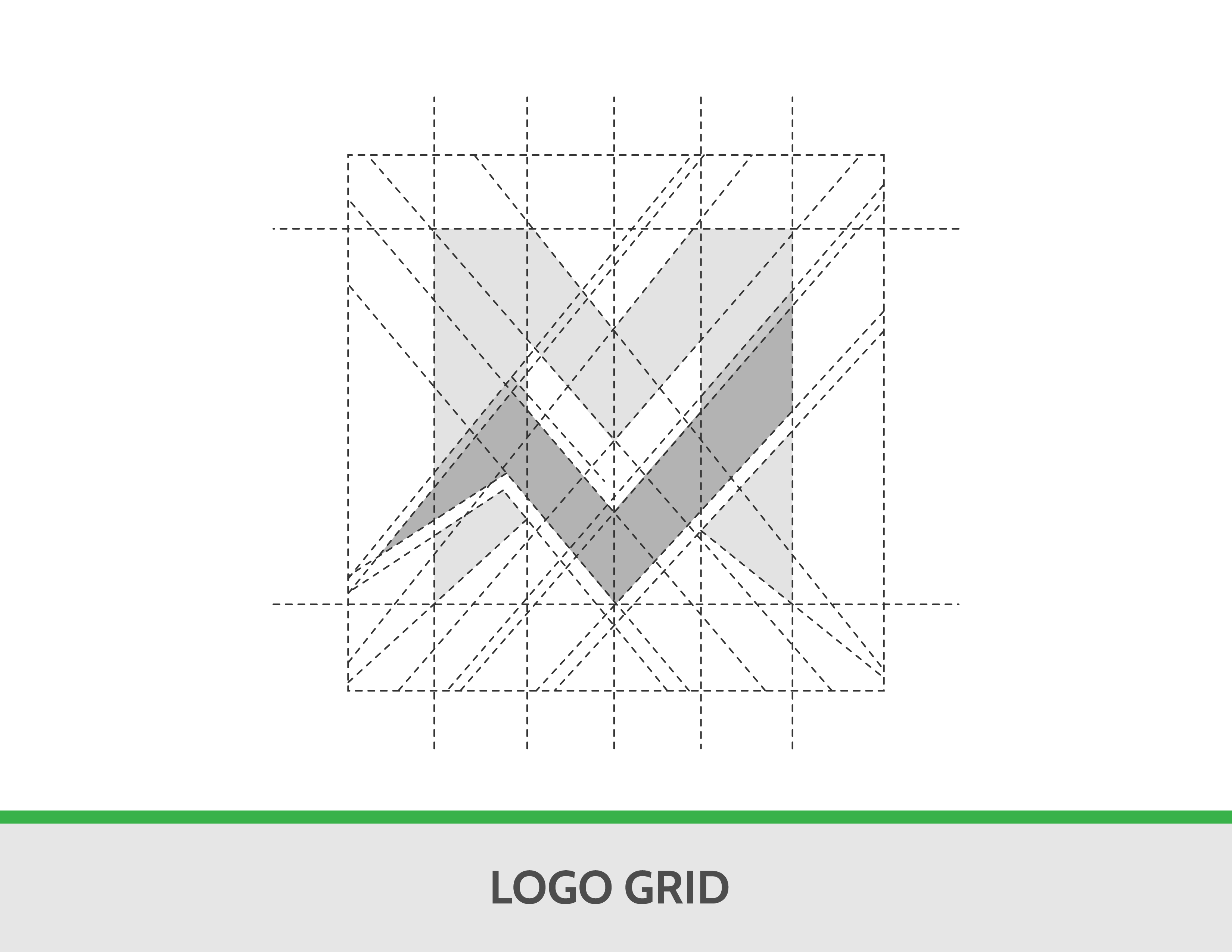
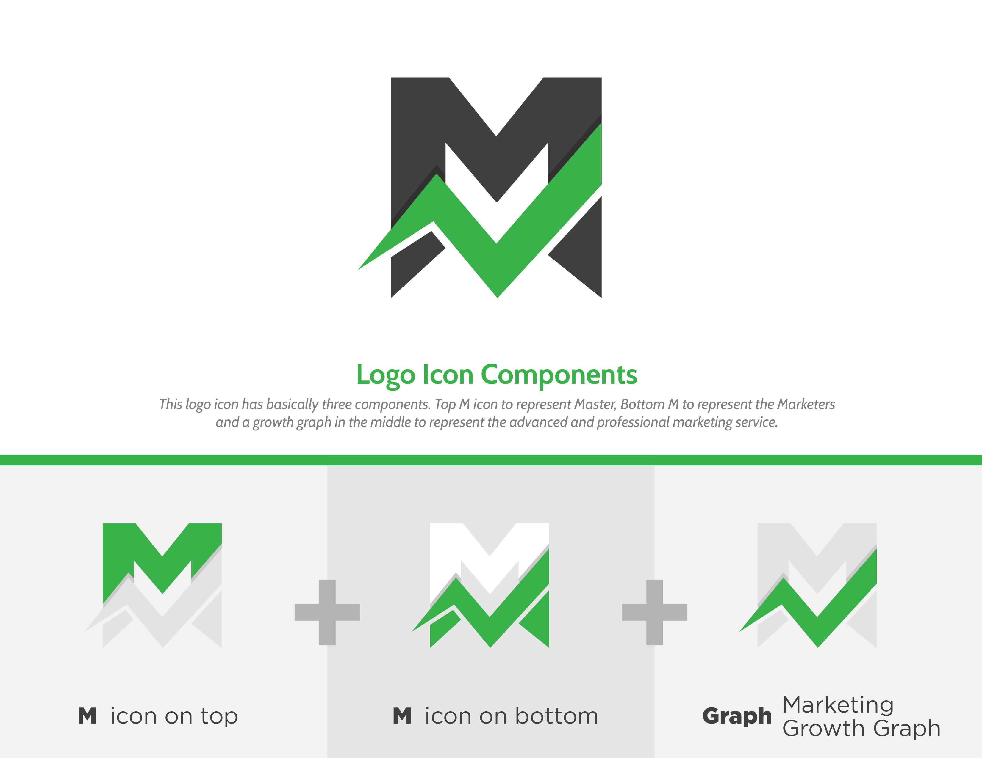
Initials Integration: The logo cleverly incorporates the initials “M+M” to stand for Master Marketers. This not only makes the logo unique but also ensures brand recognition.
2.
Market Graph Symbolism: The design includes a positive market graph, symbolizing growth and success. This element highlights the agency’s focus on driving positive outcomes for their clients.
3.
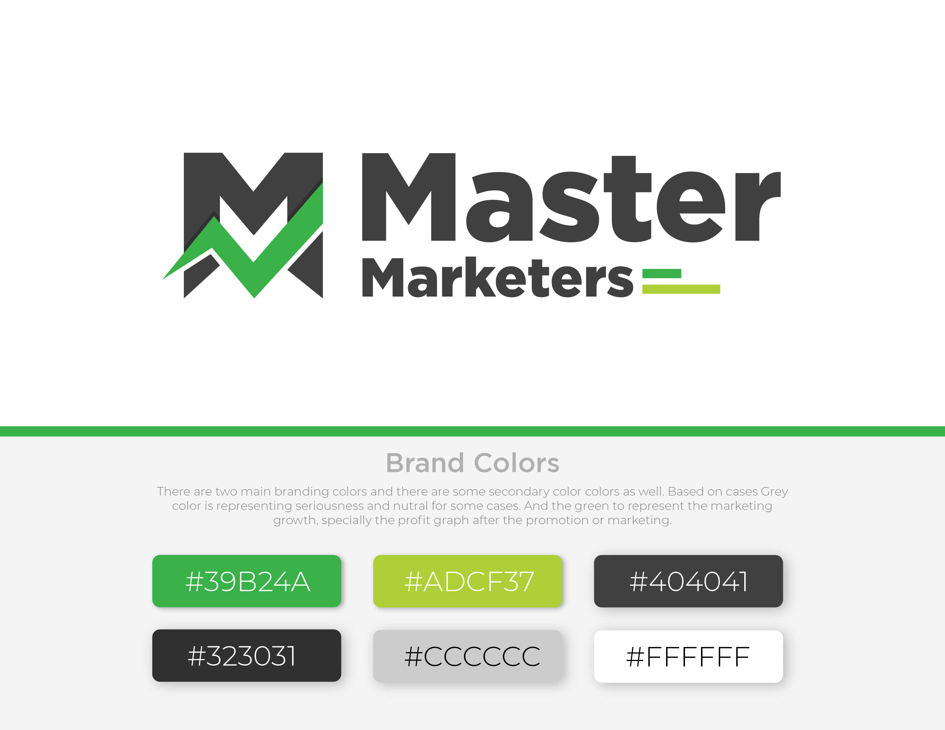
Color Palette:
• Green: Dominating the logo, green represents growth, positivity, and prosperity. It reflects the agency’s commitment to fostering positive marketing strategies that lead to sustainable success.
• Grey: Complementing the green, grey signifies trust and reliability. It underscores the agency’s dedication to building trustworthy relationships with their clients.
The Master Marketers logo is more than just a visual identity; it is a testament to the agency’s philosophy and approach. By blending meaningful symbols and a thoughtful color scheme, this logo aims to resonate with clients and convey the essence of positive marketing.
I am excited to see this logo in action and look forward to the positive impact it will have on Master Marketers’ brand presence. Feel free to share your thoughts and feedback!
I hope this blog content effectively highlights the key features and significance of your logo design! If you need any adjustments or additional details, just let me know.


