
In the dynamic world of graphic design, trends come and go, but certain principles remain timeless. One such principle is the effective use of white space. Often misunderstood or underutilized, white space plays a crucial role in creating visually appealing and functional designs. At DesignoFly, we believe that understanding and leveraging white space in design can elevate your projects to new heights.
Understanding White Space in Design
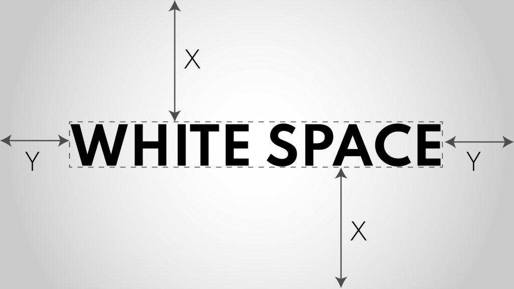
White space, or negative space, is a crucial design element that demands attention. It’s the empty areas surrounding and separating components, and contrary to its name, it doesn’t have to be white – it can be any color, texture, or even a background image. The primary purpose of white space in design is to provide visual breathing room for content, significantly enhancing readability. Designers must assertively utilize white space to create a balanced, organized, and visually appealing layout that guides the viewer’s focus and ensures a seamless user experience.
Types of White Space
- Macro White Space: This is the larger, often more obvious space that surrounds the major elements of a design, such as margins and the space between blocks of text or graphics. Macro white space helps in structuring the layout and making it more digestible for the viewer.
- Micro White Space: These are the smaller spaces found between lines of text, letters, and smaller design elements. Micro white space plays a critical role in readability and visual clarity, ensuring that content is not only attractive but also easy to consume.
The Psychological Impact of White Space
White space is not just about aesthetics; it significantly impacts how viewers perceive and interact with a design. Here are a few psychological effects:
- Improved Comprehension: Studies have shown that adequate white space can improve comprehension by up to 20%. It reduces cognitive load, making it easier for users to process information.
- Enhanced Focus: By isolating important elements with white space, you can draw the viewer’s attention to key messages or actions.
- Aesthetic Appeal: Designs with ample white space often appear more elegant and sophisticated. It gives a sense of luxury and quality, which can positively influence brand perception.
Practical Applications of White Space in Design
Web Design
In web design, white space is crucial for creating a clean and intuitive user experience. It helps in organizing content, making navigation easier, and highlighting calls to action (CTAs). For instance, a well-spaced layout can guide users’ eyes naturally from one section to another, improving overall engagement.

Print Media
In print design, white space can transform a cluttered page into a professional and inviting layout. Whether it’s a brochure, magazine, or flyer, using white space effectively can make the content more readable and visually appealing.
White space is an essential element that should not be overlooked or underutilized in print design. It serves as a powerful tool to guide the viewer’s eye and create a sense of balance and harmony on the page. By strategically incorporating whitespace, designers can establish a clear hierarchy and emphasize the most crucial elements, allowing the content to breathe and the message to resonate effectively.
Moreover, white space contributes to the overall aesthetic appeal of a design. A well-balanced layout with appropriate white space appears clean, organized, and visually appealing, instantly conveying a sense of professionalism and sophistication. This can significantly enhance the perceived value and credibility of the brand or message being communicated.
In contrast, a design that lacks sufficient white space can appear cluttered, overwhelming, and difficult to navigate, potentially deterring the viewer from engaging with the content. By embracing the power of white space, designers can create layouts that are not only visually stunning but also highly functional and effective in capturing and retaining the audience’s attention.
Importance of White space in design – Branding & Identity
Importance of White Space in Logo and Brand Identity Design
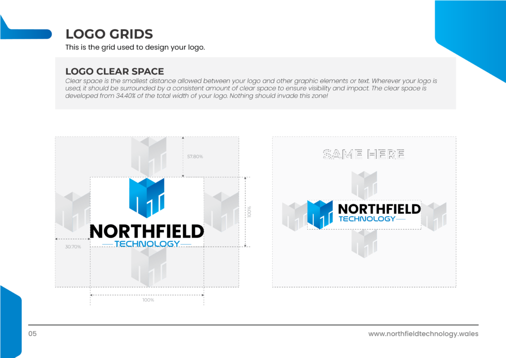
Embracing white space in logo design is a strategic choice that can significantly elevate a brand’s visual impact and memorability. By allowing ample breathing room around the logo, it becomes the focal point, uncluttered and uncompromised. This negative space not only enhances legibility but also lends a sense of sophistication and confidence to the brand’s identity.
Moreover, a logo with white space conveys a sense of simplicity and modernity, aligning with contemporary design principles that favor clean and minimalistic aesthetics. This approach resonates with audiences who appreciate understated elegance and allows the logo to transcend trends, ensuring its timeless appeal.
Importantly, white space in design also provides flexibility in application. A logo that is not overcrowded can be seamlessly integrated across various mediums, from print materials to digital platforms, without losing its integrity or becoming visually overwhelming. This versatility is invaluable in maintaining brand consistency and cohesion across diverse touchpoints.
Importance of White Space in Design with Neat & Clean Branding
In branding design, the strategic use of white space is paramount to creating a clean and professional look. White space, or negative space, surrounds and separates design elements, allowing each component to stand out without overwhelming the viewer. This neat presentation enhances readability and ensures that key messages and brand elements are easily digestible. By providing visual breathing room, white space helps communicate a sense of quality and sophistication, which is crucial for building a strong and positive brand perception.
Moreover, white space plays a critical role in directing the viewer’s attention to the most important elements of a brand design. It allows for a clear visual hierarchy, guiding the audience through the content in a logical and engaging manner. This can be particularly effective in logo design, where simplicity and recognizability are essential. A logo surrounded by ample white space becomes more memorable and impactful, reinforcing the brand’s identity. Ultimately, a clean and well-organized design not only looks aesthetically pleasing but also conveys a sense of trustworthiness and professionalism, which are vital attributes for any successful brand.
Common Misconceptions About White Space in Design

Despite its benefits, white space is sometimes misunderstood. Here are a few myths we’d like to debunk:
- White Space is Wasted Space: On the contrary, white space is a strategic element that enhances readability and focus. It’s not about filling every inch of a canvas but about using space wisely to guide the viewer’s eye.
- More Content is Better: While it might be tempting to cram as much information as possible into a design, this approach can overwhelm and deter viewers. Strategic white space ensures that the essential information stands out and is easily digestible.
- White Space is Only for Minimalist Designs: While white space is a hallmark of minimalist design, it’s beneficial in all styles. Whether your design is maximalist or somewhere in between, white space helps in balancing the elements. White space is also important in crowded branding. You can notice easily they use various font sizes to make it crowded, but the large font brings too much white space in the design.
To explore about types of logos, visit our blog…

How DesignoFly Utilizes White Space for Exceptional Design
At DesignoFly, we don’t just follow design trends; we set them. Our expert team understands the nuanced role of white space in creating impactful designs. Here’s how we ensure your designs are not only beautiful but also functional:
- Custom Solutions: We tailor our design strategies to meet your specific needs, ensuring optimal use of white space to highlight your brand’s unique strengths.
- User-Centric Approach: We prioritize the end-user experience in every design decision, leveraging white space to create intuitive and engaging interfaces.
- Innovative Techniques: Our designers stay updated with the latest design principles and technologies, applying innovative techniques to make your brand stand out.
Have a look at our Behance Portfolio
where you can easily find some good examples of white space in design
Behance Portfolio
Conclusion
White space is a powerful tool in the hands of skilled designers. It enhances readability, directs focus, and adds an element of sophistication to any design. At DesignoFly, we harness the potential of white space to create visually stunning and effective designs tailored to your brand’s needs.
Partner with DesignoFly, and experience the difference that expert design can make. Our commitment to excellence and our understanding of key design principles, like the effective use of white space, ensure that your projects will not only meet but exceed your expectations. Reach out to us today, and let’s create something extraordinary together.
Contact DesignoFly – where creativity meets strategy and white space is transformed into a canvas of endless possibilities.
GET IN TOUCH
Contact us

May 26, 2024